Thursday, 23 December 2010

Question 4: How did you use media technologies in the construction and research, planning and evaluation stages?


3. What have you learned from audience feedback

.
Here is a clip showing peoples reaction to both the film cover and the magazine front cover. The general tone is positive though there are some aspects that the public though needed improving, these were: The character in the magazine front cover was not prominent enough, we could change this by changing the contrast on the picture. Or we could take same new pictures and pay more attention to the lighting his time, this would almost definitely require us to hire special lighting, which could also use for the filming itself. But since we have limited economy, we could also simply arrange household lighting in a particular way to illuminate the character of William Files A.K.A the monkey. Some thought that it did not look professional enough as it didn't have enough information pertaining to the screening. Others thought that the tagline was not evident that it was a tagline at all, this could be ratified by simple photoshop manipulation of the text so that . But taking into account the negative, the overall feeling towards it was positive. indicating that we as a group did a good job creating the poster and the magazine front cover.


Question 2: How effective is the combination of your main product and ancillary texts

Overall we have created a strong publicity campaign, encompassing are main product and our ancillary texts. The main aim for all of this is to get people into the cinema to watch our film and I think that our publicity campaign would just that. Here i will go over how i think each part of our publicity campaign would draw in an audience and then talk about the way we would introduce it starting with the poster, designed by me.

Movie Poster
we would start the campaign off by simply releasing the poster, this would subtly create hype. this is due to the fact that no-one will know exactly what it is at first, the only thing that will be shown in the poster is the tagline: "Daddys Little Girl", the main picture and the general colour scheme and feel of the whole campaign, the deep reds and powerful onyx black. This will generate interest amongst the hardcore fans but will slowly spread through the internet, we will pout posters up around in cinemas, and then eventually it will spread into more mainstream places like billboards, and wall adverts in shopping centres. Also word of mouth will be a huge means of propagating for us, due to the fact the poster is such an enigma, and is quite different to most, people will discuss its meaning. Then after is has gestated in the minds of the public will then release the teaser trailer.

Teaser Trailer
The trailer will first be released on the internet, through trailer and movie sites such as apple trailers and rotten tomatoes , this will cause a stir on the internet, which by the way will be another version of word of mouth, just a much larger global one. People will write articles about it, and social networking sites will be awash with people linking to the new trailer. Then after this it will be released in theatres, since the trailer has no violence and is suitable for people of any age, we will reach a very large audience.

Magazine Front Cover
Then finally as the hype steepens and the interest grows we will release the magazine dedication, we are using fright magazine due to its very large readership. This will finally give all the people who were interested in the trailer and poster a greater insight into what the film is really about.


Through all these three products i feel that we could cultivate a huge audience even before anyone has ever seen the film, simply due to interest in these, this means that many people will come to the cinema and see our film. I believe we have done quite a professional job in terms of creating a fully realised publicity campaign

Good Intentions Teaser Trailer [Final Edit]

Question 1: In what ways does my media product use, develop or challenge forms and conventions of real media products?

Question 1: In what ways does my media product use, develop or challenge forms and conventions of real media products?

Magazine Front Cover

Friday, 19 November 2010

Music for Video

I just found an extremely helpful website with a vast library of free sound effects specific to trailers, here is a link to the website and here, here and here are some possible sound effects we will use for our trailer
.

Poster Draft 1

Sunday, 14 November 2010

Flickr

I have just created a flick account so i can have a place to put all of the pictures our group has taken. Here is a link to the Good Intentions Media Flickr page.

Good Intentions Title Version 01

To create an authentic movie title for the trailer, with animation and non diegetic sound, I scoured the internet and looked for ways to do this. In the end i found a website call AE TUTS which had several tutorials showing how to do this. Luckily the program needed, Adobe After Affects was already loaded onto my computer. I followed this specific tutorial and changed the colour and text to red and Good Intentions.


I then added a thunder clap sound effect in iMovie 09.


This is the finished outcome.

Good Intentions Title Version 01

Friday, 12 November 2010

Fonts Research


Titles Research

Here I will research some title fonts used in contemporary horror films, to gauge the factors which combine to create the final outcome used in posters, adverts and in the film itself. This bleeds into the whole theme that a film takes on, what i mean by this is that each film has a certain set of colours, fonts, and effects used their publicity campaign that are constant and dont change, and eventually become synonymous with the films itself. So the fonts i pick eventually will be used in every aspect of the publicity campaign.


Almost all of them are in capital letters, this is done to emphasize them, also to add to this they are in bold.


Wednesday, 10 November 2010

Production Companies Research

For our trailer we need to have

Work from Teammates - Planning

This whole project is a group effort and there is lots of work that has been allocated to my teammates, but adding their work to mine would the blog to confusing so I am going to give a list of links showing the work that has been done by my teammates the relates to our group work.

Jack Dalziel

Choice of Weapons

Alex Perez Davies

Health and Safety Report

Risk Assesment

Target Audience Profile

Shot List Vlog [Video Blog]

Monday, 8 November 2010

Work from Teammates - Research

This whole project is a group effort and there is lots of work that has been allocated to my teammates, but adding their work to mine would the blog to confusing so I am going to give a list of links showing the work that has been done by my teammates the relates to our group work.

Jack Dalziel

Horror Iconography and Ideology

Alex Perez Davis

Websites of Slasher Horror

Themes/Motifs/Ideology

Slasher Horror Costume Research

Publicity Campaign

I am now going to make a study of current publicity campaigns of a movie (I didnt specifically focus on horror films due to the fact there a lots of similaritys between them and normal movies, yet whenever possible i will use horror specific examples) to gauge all the aspects of it, this way when it comes to our publicity campaign work I will have a real basis in which to use as a template. Nowadays when a film comes out publicity campaigns make use of every advertising outlet there is, and due to recent developments in technology these are far and plentyfull, reaching a wider audience of potential movie goers than ever before. I will go through this list highliting the advantages and disadvantages while giving examples in real life.

Social Networking

Billboards

Adverts

Trailers

Posters

Promotional Giveaways

Research Location Settings

The location of horror films plays an integrel role in the generation of the atmosphere which is so definfing of a horror movie, due to the fact that our eventual horror trailer will have four diferent locations I will now research the salient conventions of the locations in contemporary horror movies.

Deserted
The location as ussualy devoid of alot of humans and is thus devoid of humanity therefore creating a sense that the conventional norms of society do not apply, this again creates an tense atmosphere were alot could go wrong. Added to this lack of society in the location theres is no emergency services, this leads to a the feeling that if in the lickly case that something goes wrong there is noone to help them but themselves, there is a highly prominent theme in The Hills have Eyes


Dark History
The location could in some cases have had something terrible happen there long ago, this is ussually recounted by one of the residents and is used as foreshadowing the future events. This is done to plant the idea or theme of whatever horrific incidents the film revolves around into the viewers mind. A good example of this is in friday the 13th, in the loaction the young people are in, crystal lake, Jason mothers was murded years before.


Foreign
The Locations of horror movies are almost always foreign (just to make it clear, i do not mean that the location is in another country, though this can happen, I mainly am talking about a place in which the protoganist are not accustomed to) to the protagonists, this is done due to that facts that it creates an atmosphere in which anything could happen, so the audience will always be on edge as to what is about to happen. Though protagonistsare always foreigners in the location, there are always local inhabitants, these are often the antagonists, but not always. A good example of this foreign location plus local inhabitants dynamic is the 2003 version of The Texas Chainsaw Massacre in which a group of travellers stop in a deserted Texan town in which the local inhabitants are acomplaces in the killing of the foreigners.


Often Night Time
Obviously wherever they are for the most part it will be night time. It may start as day yet, often coinciding with the level of tension aroused by circumstance and incidence it will gradually become dark. This is a horror movie staple and i doubt there is a salsher horror in history that doasnt feature this. Or if there isnt the concept of night and day, such as in space horror movies, it will be mostly dark. I beleive this plkays on the childhood fear of the dark, reducing the audience to the most primal of fears. A good example of this is the movie 30 Days of Night.

Friday, 5 November 2010

Titles

The Forgotten Life
This is in reference to how the antagonist has been forgotten from society, and is detached in this way, the bad side of this is it doesn't reference the main protagonist.

Father Death
This tackles the idea that the antagonist, William Fyles sees his relationship with Sarah as a father daughter dynamic but it is twisted by the death filled past.

Barbed Wife
This is in reference to the antagonists shady relationship with x wife. The problem is that the story doesn't revolve around this action.

Innocence
This is referencing both the innocence of the main girl and the innocence of the killer, who believes himself to be doing a just thing by capturing the girl.

Good Intentions
This is referencing how William Fyles, the antagonist sees his actions, but in reality there are morbid and disgusting.

Me and the group discussed these ideas and we eventually decided on Good Intentions this was mainly due to the fact that it is quite subdued yet behind the surface it is a very creepy state of mind for the killer to have, our inspiration for this was films like The Lovely Bones and Hard Candy

Action Plan


Shot List Scan

Below is a story board that jack, Alex and I created over the holidays, it outlines every shot and details what event s happen in each along with visual accompaniment.


Shot list
View more documents from stoliros.1
1: I used Mr. Rosen's (our media teacher) Slideshare account due to the fact I was not able to do this on the school computers.

Wednesday, 3 November 2010

Progress Review

Today we have reviewed our progress so far and planned out how to progress from here.
we were giving a marking scheme so that we could mark our current research and planning. My overall blog was 13/20. After this we were given an action plan so that we could specifically write every bit of work our group has to do in order to start filming.

Monday, 1 November 2010

Characters

Sarah Jennings Played by Daisy Holland - Young innocent girl, Protagonist, last girl, wanderer

Darren Jennings Played by Edwin Cookson - Brother, Distant from family and sister, Archetypal stoner, party goer character, little compassion for the sister

Thomas Micheals - Friend of darren, similar in character

Simon Jones - Friend of darren, similar in character

Lilly Anderson - Played by Holly Keller-Cooper Typical Tom Boy Character, slightly more compassionate than the boys.

Bernard Jennings played by David Dalziel- Father of Darren and Sarah, Very nice to daughter, Feels antipathy for son due to his lifestyle.

Mary Jennings Karen Dalziel - Mother of Darren and Sarah, Typical mother, Worried about camping trip, Maternal.

William Fyles Played by Erhan Korkman - Antagonist of the film, wears a mask, Has turbelant past, Mentally Ill, is a killer.

Props

Friday, 22 October 2010

Mise en Scene

Mise én Scene is an expression used to describe the visual style of a film. The Mise én Scene within horror films plays a highly important role in creating the conventional atmosphere in which we are accustomed to. Because these will be an important part of filming I will now research into the Mise én Scene of horror films. I will do this by trying to dissect the aspects which make the mise en scene what it is.

Lighting
The lighting within horror movies is an integral part of creating atmosphere. The lighting is often very dark but has lights shone on the protoganist or antagonist or whoever the shot is focusing on. This is brought about by having a dark, dimly lit setting, accompanied by coloured light, we will use this technique within our trailer.

Colour Scheme
The colour scheme of film is often a dark pallete of deep blues greens and reds, depending on the scene. It is hard to define yet what interesting thing comes up is the fact the a films colour scheme is consistent throughout the film, and often transported into the posters and adverts. This is to keep a consistent definitive mood that makes the film easy to identify. Before doing our filming we will create a colour scheme in which to base each shot on in tyerms of the colour, this will help add a visual consitency to the film making it seem a higher standerd.

Decor
The decor of the film is an important way of creating subtle atmospheric nuance in which the veiwer can become more immersed within the world of the film.

Wednesday, 20 October 2010

British Board of Film Classification 15

’18′

Suitable only for adults

No-one younger than 18 may see an ‘18’ film in a cinema.

No-one younger than 18 may rent or buy an ‘18’ rated video.

In line with the consistent findings of the BBFC’s public consultations and The Human Rights Act 1998, at ‘18’ the BBFC’s guideline concerns will not normally override the principle that adults should be free to choose their own entertainment. Exceptions are most likely in the following areas:

  • where the material is in breach of the criminal law, or has been created through the commission of a criminal offence
  • where material or treatment appears to the BBFC to risk harm to individuals or, through their behaviour, to society – for example, any detailed portrayal of violent or dangerous acts, or of illegal drug use, which may cause harm to public health or morals. This may include portrayals of sexual or sexualised violence which might, for example, eroticise or endorse sexual assault
  • where there are more explicit images of sexual activity which cannot be justified by context. Such images may be appropriate in ‘R18’ works, and in ‘sex works’ (see below) would normally be confined to that category.
ddd

British Board of Film Classification Research

The British Board of Film Classification is an independent, non-governmental body which has classified cinema films since it was set up in 1912 and videos/ DVDs since the Video Recordings Act was passed in 1984. Basically, it gives each film released a rating that defines what age the audience who view the film have to be. Creating a promotional campaign for a slasher horror film i will decide on which classification age limit is appropriate for our trailer.
Universal – Suitable for all

It is impossible to predict what might upset any particular child. But a ‘U’ film should be suitable for audiences aged four years and over. ‘U’ films should be set within a positive moral framework and should offer reassuring counterbalances to any violence, threat or horror.

If a work is particularly suitable for a pre-school child to view alone, this will be indicated in the Consumer Advice.


Parental Guidance

General viewing, but some scenes may be unsuitable for young children

Unaccompanied children of any age may watch. A ‘PG’ film should not disturb a child aged around eight or older. However, parents are advised to consider whether the content may upset younger or more sensitive children.


Suitable for 12 years and over

Exactly the same criteria are used to classify works at ‘12A’ and ‘12’. These categories are awarded where the material is suitable, in general, only for those aged 12 and over. Works classified at these categories may upset children under 12 or contain material which many parents will find unsuitable for them.


Suitable only for 15 years and over

No one younger than 15 may see a ‘15’ film in a cinema. No one younger than 15 may rent or buy a ‘15’ rated video work.

Discrimination

The work as a whole must not endorse discriminatory language or behaviour.

Drugs

Drug taking may be shown but the film as a whole must not promote or encourage drug misuse. The misuse of easily accessible and highly dangerous substances (for example, aerosols or solvents) is unlikely to be acceptable.


Suitable only for adults

No-one younger than 18 may see an ‘18’ film in a cinema.

No-one younger than 18 may rent or buy an ‘18’ rated video.

In line with the consistent findings of the BBFC’s public consultations and The Human Rights Act 1998, at ‘18’ the BBFC’s guideline concerns will not normally override the principle that adults should be free to choose their own entertainment. Exceptions are most likely in the following areas:

  • where the material is in breach of the criminal law, or has been created through the commission of a criminal offence
  • where material or treatment appears to the BBFC to risk harm to individuals or, through their behaviour, to society – for example, any detailed portrayal of violent or dangerous acts, or of illegal drug use, which may cause harm to public health or morals. This may include portrayals of sexual or sexualised violence which might, for example, eroticise or endorse sexual assault
  • where there are more explicit images of sexual activity which cannot be justified by context. Such images may be appropriate in ‘R18’ works, and in ‘sex works’ (see below) would normally be confined to that category.

In the case of video works (including video games), which may be more accessible to younger viewers, intervention may be more frequent than for cinema films.

Monday, 18 October 2010

Stock Characters in Slasher Horror Research

In horror movies there are several recurring archetypal stock characters with definate characteristics that make up the cast, to help with creating characters in our film trailer i will research these characters and their characteristics.

The Wanderer
The wanderer is a character who strays away from the group to investigate something, and at sometime in his or her journey gets murdered by the antagonist or kidnapped, but mostly killed. A good example of this is Andy (Mike Vogel) in the Texas Chainsaw Massacre 2003 dir. Marcus Nispel. He goes off to look for his friend and gets taken by leatherface.


The Popular Girl
The Popular Girl is often an arrogant, pretty, popular girl that is die within the the logic of the film, she often thinks herself before others and is paid back with some negative consequences, she is often romantically linked with one of the jocks. An example of this character are the cheerleaders in jeepers creepers 2.


The Jock
The Jock is large sporty male, who is probably not very intelligent but does have power within the group, he often tries to do something heroic but endings up being killed. An example of this is the male in the picture above from jeepers creepers.

the final girl
The final girl is a horror film (particularly slasher film) trope that specifically refers to the last woman or girl alive to confront the killer, ostensibly the one left to tell the story. The final girl has been observed in dozens of films, including Halloween, Friday the 13th, A Nightmare on Elm Street, The Texas Chain Saw Massacre, Alien and Scream.


The Pervert
The Pervert is a character that peeps at a girl while she isn't looking and often gets killed eventually or as a result of this, and example of this is


Friday, 15 October 2010

Stars of Horror Movies Research

To gauge the traits of an archetypal horror star i will analyze some of the biggest horror stars of hollywood. I will analyzing things such as: Movies they have starred in, age, how they look and the characters they play

William Defoe
William Defoe has starred in a selection of horror movies for example: Anamorph and Antichrist I will now list some of reasons why he has been chosen to be a horror protagonist or antagonist. He often plays very serious, bordering on scary characters, so he has built up a repuatation of being like this, this make the audience associate with this type of role instantly and there isn't as much need to set up the type of character. He also has quite a scary looking face. He is in his mid 50s, this is ideal due the fact that the very intense scary archetypal characters in lots of horror movies are about this age. When we film we will try to find a actor with a similar sense of intensity for the role of the pedophile, if we do eventually follow through with this idea.

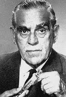
Boris Karloff
Boris Karloff (23 November 1887 – 2 February 1969), whose real name was William Henry Pratt, was an English-born actor who emigrated to Canada in the 1910s. Karloff performed in a variety of contexts throughout his career, but is best remembered for his roles in horror films and his portrayal of Frankenstein's monster in the 1931 film Frankenstein, 1935 film Bride of Frankenstein, and 1939 film Son of Frankenstein. His popularity following Frankenstein in the early 1930s was such that for a brief time he was billed simply as "Karloff" or, on some movie posters, "Karloff the Uncanny".