Saturday, 11 September 2010

Trailer Analysis


The film I will analysing is Due Date

At what point in the trailer are we told the name of the film? Why is this?

We are told the name of the film near to the end of the trailer, this is for to main reasons firstly to make us associate the common convention of having a crescendo towards the end of the film and at the pinnacle of this the action is embodied in the trailer. Secondly it makes it easier to remember for the audience.


Why are we told who is starring in the film? How is this information given to us? Why?

The audience associates

movies with the protagonists, and subsequently the actors. So advertising the movies high profile actors will boost revenue. The information is presented in large font across the screen with similar stylistic value as the title.


What type of action from the film do we see?

We see mostly dialogue and driving in a car. They clips shown are most likely to be the most popular in the actual film.

What clues does the music give us as to what type of film the trailer is advertising?

The music is fast paced generic indie rock, implying an action film.


What can you say about the voice of the person who is giving the voice-over? Why do you think this voice was chosen? What effect does it have?

The is no voiceover, only the actors dialogue over text.


How does the speed of what we see com

pare to watching a clip of the film? Why is this? Does the pace alter through the trailer does it stay the same?

The speed, aside from the first scene of the trailer is very fast paced and it crescendos towards a climax when it shows the title.


What information are we given in the very last frame of the trailer?

The tagline: “Keep pushing”, the website and the production company.


Which is more affective in making you want to see the film, the poster or the trailer? Why is this?

For me the trailer elicits more of a response because it gives me more of an idea of how the film will actually be like.


Where would you expect to see this trailer: (give reasons)

a) before what films at the cinema? Action films/ comedy films, mainly male oriented films

b) In the breaks of which TV shows? Comedys, Action, Cop dramas and Sports.

Film Title Analysis

Film Titles

Look at the titles of the trailers in all the groups. What clues do they give you as to what the film is about? Explain what you are basing your ideas upon, an association with a particular word or phrase? is it knowledge of other films


Don't Be Afraid Of The Dark

To me this could be either a children’s film or a horror/thriller. This is because most people have memory’s of people telling them to not be afraid of the dark as children inevitably are, this is why I make the connection too childhood, though this could be an adult horror film playing with the fear that we can feel as a child.


MegaMind

This to me seems very likely to be a children’s film. This is due to the childish use of alliteration often seen in children’s movies to make them easy to remember and the concept doesn't seem like an adult theme.

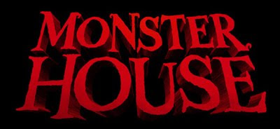
Monster House

My first impression of the title “monster house” is that it is probably a movie for children with some sort of fear factor to it. This is due to the childish connotations of the word monster coupled with abstract almost silly idea of a house being associated with them.

Flight 93

Instantly I have come to the conclusion that flight 93 is an adult film, this is due to the mundane title. This would not excite children at all. The titles implication is that there is something extraordinary about flight 93, and there has been, in recent years a very extraordinary flight, that hit the world trade centre. So the movie could be about this.


Film Titles Visual

Freeze a frame where you can see the title of the film. How does the style of the font used give you an idea of what the film is about


Don't Be Afraid Of The Dark

The font used in this is an emulation of a handwritten calligraphy, This is made evident by the quick sharp style of it, yet also there are ink blots around it suggesting it is hand done. Moreover it relates to the title of the film. The background is in black contrasting with the bright typography.


MegaMind

This font is very typical of of a children's movie. The block writing is distorted to show the large emblem in the centre. this emblem in the middle has implicit harry potter connotations too make the audience feel more familiar.


Monster House

This is a mix of to genres that don't usually mix, horror and children's. Yet with the title thats exactly what they have done, they have used the classic horror font but done it in big red letters like lots of comedy/ children's films.


Flight 93

This has connotations of modern air force connotations. It is black and white to emphasize its importance.


What is more important in a trailer - Sound or Images?

I think sound can be very resonant in a viewers mind and can create a lot of atmosphere. Yet really i think that the visual style alone has more impact on a viewer, as well as the fact that the images can make aware of what you can expect from a film.


The Meeting Video

Here i will go through the film discussing the techniques used

Title Shot


The title is overlayed on to a pan from right left of the school grounds, thus acting as both a title shot and an establishing shot


The Meeting

This lesson we were given the brief to use cameras, tripods and iMovie to create a 1 minute film entitled "The Meeting". Mr. Rosen gave us very little information on how to shoot the film, yet this was intentional because this task was devised with the intent of being an introduction to filmmaking. As Mr. Rosen said, he was 'Setting us up to fail'. Alex, Joey, Jack and I went out and made the film, we tried to use shooting techniques we had learnt from the previous project, yet our understanding of them was not sufficient enough. The film was about a meeting between two old friends, one having changed a lot and has become very confident, and the other is much less brave thus resulting in an awkward situation.

Evaluation
At the end of the lesson we viewed everybody else's final edited film, all entitled the "The meeting". The results varied from watchable to very dull and not immersive. But none of them were of very high quality, this, I think is due to a lack of time partly, but mainly it was lack of applying knowledge. This influenced me to create a few key points that are very important when making a short film. I picked these up, when the class and Mr. Rosen were commenting on our films.

1. Keep it snappy. By this I mean keep all of the shots short and eventful, there was one film we viewed that had very interesting and dark subject matter yet the first shot lasted 1 minute 23 seconds, and not much happened in that time. This completely damaged the atmosphere the film was trying to create.

2. Abide by the laws of editing. Last year we did a lot of studying mainly focused on editing so we do have a good foundation of knowledge that we can refer to when we create our trailers.

3. Make the plot evident. By this I mean do not diverge from the story. This is due to the fact that it is too hard to keep ones attention focused if the narrative has no definite parameters.

Pete Fraser

In July 2010 Pete fraser, (pete frasers title) took over one of our media classes. He took us through some blogs that were of high level. And then we did an activity were we charted our media through the AS year by depicting it as island and negative or positive impacts as features on the island. This was mine: [insert picture of scanned in island]
Then he spoke to us about what next would entail. Overall this session was very helpful in not only the preparation for next year, but also the validation of what we have already done.

Prezi
Prezi is a zooming presentation editor that is all online. There is no program download. This is extremely helpful to me because it is a fast and simple way to create a dynamic, comprehensive presentation. This a good example of how media is progressing, a few years ago the only we to make a presentation like this would to buy and expensive application for it and it could possibly take along time.

Tutorial Video
This is a video tutorial of how to use prezi, this is from the website yet there was link to youtube so I embed the video.

Introduction

We are now starting the A2 coursework: A2 G324 Advanced Portfolio. This coursework is actually going to be purely online, and has to be electronically submitted on December 1st 2010.

Film Promotion
The OCR brief asks you to produce: A trailer and two of these three
  • Home page for the film
  • Poster
  • Magazine cover featuring the film